
The Religious Breakup? Visualizing Mormon Political Movement (2008–2024)
Happy Holidays from Mormon Metrics!


Thanks for reading and being engaged with Mormon Metrics this year. I truly appreciate your readership and support. Today will be the last post for the year and posts will continue again in the first half of January. Assuming I am able to set aside enough time over the break, I am planning on releasing my second report in January on a topic I know many of my subscribers will find interesting, so stay tuned 😉
Introduction
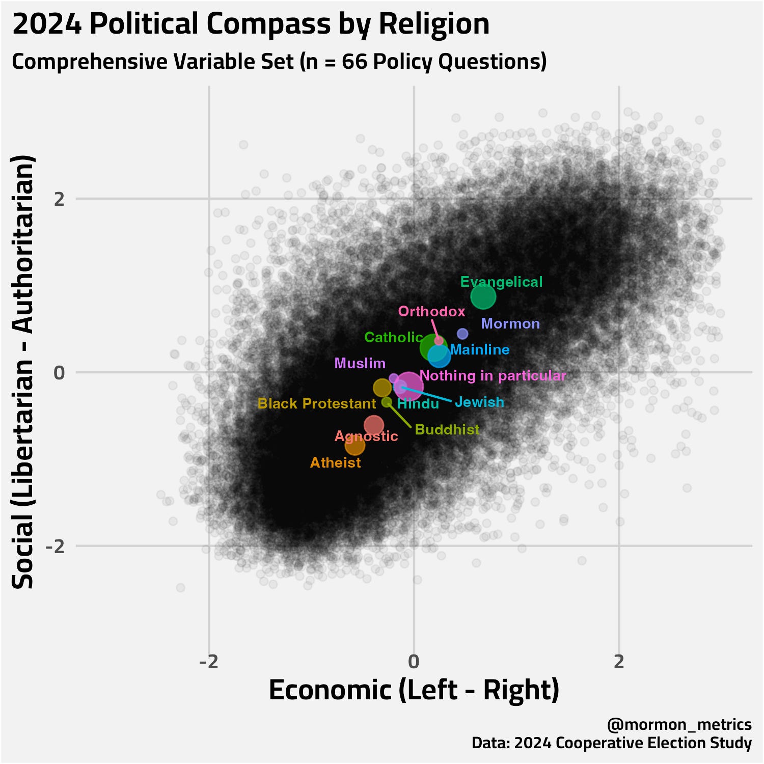
In my last post, I visualized the US electorate on a political compass using 2024 data.

The standout finding for many was the positioning of the average Mormon respondent, who appeared ideologically closer to Mainline Protestants and Catholics than to Evangelical Christians.
Naturally, this raised a few questions: Was it always this way? Is this a recent phenomenon, perhaps a reaction to the Trump era? Or have Mormons always been the “moderate” cousins of the Religious Right?
To investigate, I went back to the archives. I applied a similar methodology to Cooperative Election Study (CES) data from 2008, 2012, 2016, and 2020 to try and trace the movement over time. I hope you like political compasses because today I have 4 more of them for you 🧭.
If my last post was a snapshot, I view this as an attempt to assemble a timeline.
A Note on Methodology A quick but important caveat before we look at the charts: The CES survey questions change every cycle. In 2008, the survey might ask about the Iraq War; in 2020, it asks about COVID policies. Because the inputs change, we shouldn’t focus on the absolute coordinates (e.g., “Mormons moved exactly 0.5 units left”). Instead, I think it is more useful to look at the relative distance between the groups. Who is standing next to whom?
The “Twin Pillars” Era (2008–2012)
Let’s look back at the Obama years.
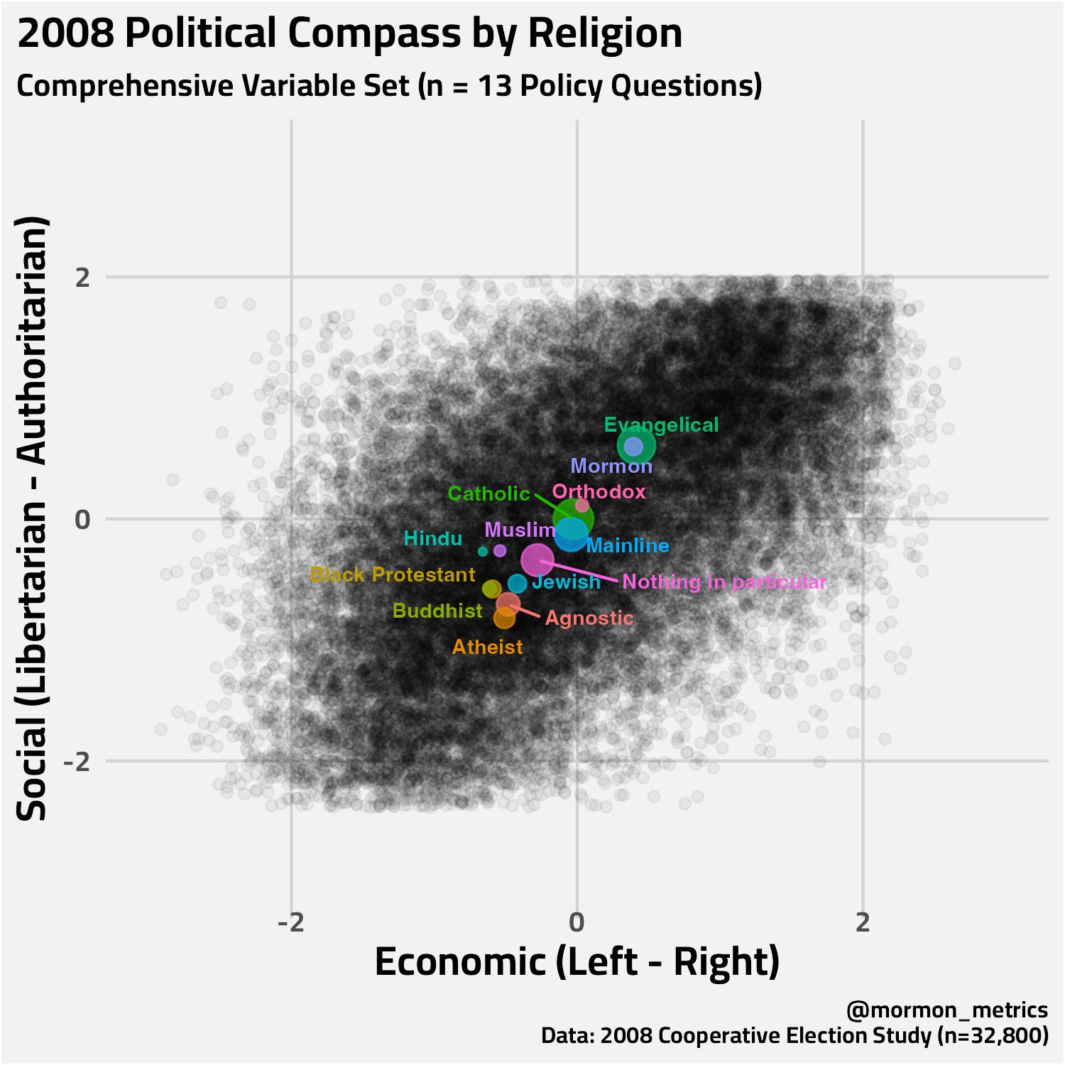
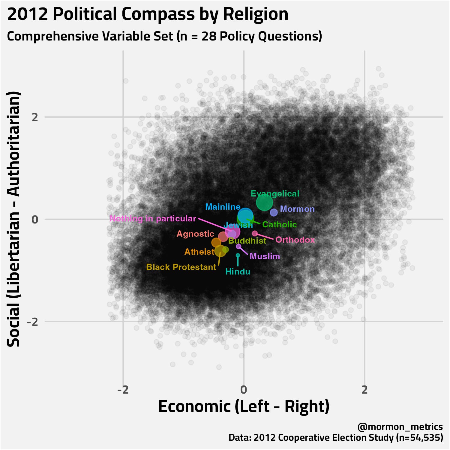
In 2008 and 2012, we see significant alignment between Mormons (Purple) and Evangelicals (Green).
Visually: The groups are positioned quite close together in the conservative quadrant. Our Evangelical and Mormon dots are either overlapping or equally as far into the conservative quadrant.
The Interpretation: In both of these time periods, both Evangelicals and Mormons are squarely conservative. In 2008, they are essentially overlapping! Interestingly in 2012, we can perhaps see a slight skew/preference Evangelicals drifting more populist and Mormons drifiting more libertarian.
The Divergence Begins (2016)
Then comes the 2016 election.
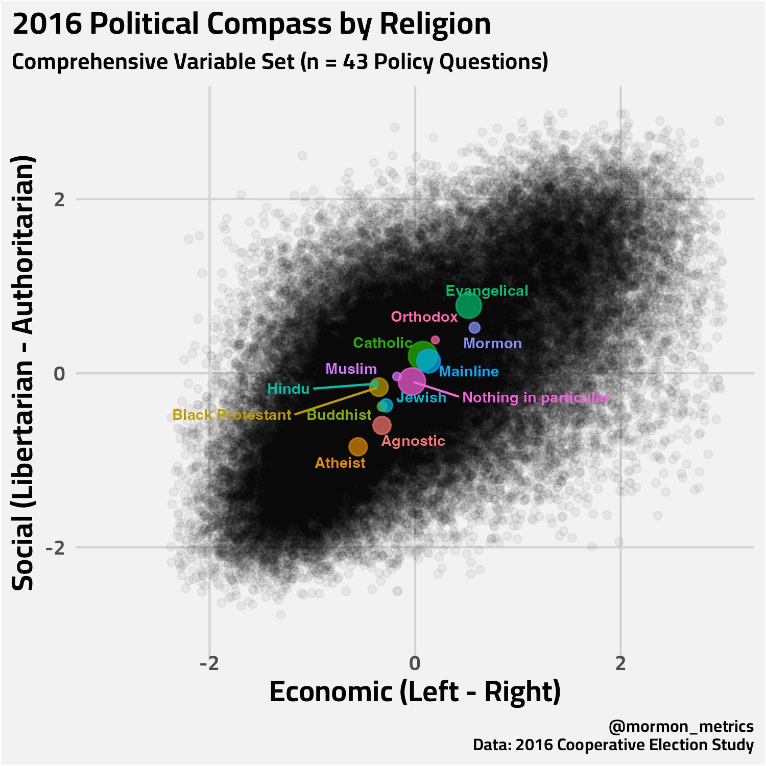
Here, we start to see what looks like a drift.
The Shift: While both groups remain in the Conservative quadrant, a gap begins to form, particularly on the Social Axis (Y-Axis). The average Evangelical respondent plots slightly higher (more authoritarian/populist), while the average Mormon respondent stays put or drifts slightly more downward. Evangelicals appear to be moving away from other religious groups and Atheist in the other direction (religion is becoming more predictive of politics).
Context: This visual seems to capture the initial Mormon hesitation toward Donald Trump. While Evangelicals largely embraced the new populist direction of the GOP, many Mormons (perhaps the Evan McMullin voters) appeared to separate slightly from the coalition — while remaining firmly in the conservative quadrant.
The Decoupling (2020–2024)
By 2020 and 2024, the separation becomes much more distinct.
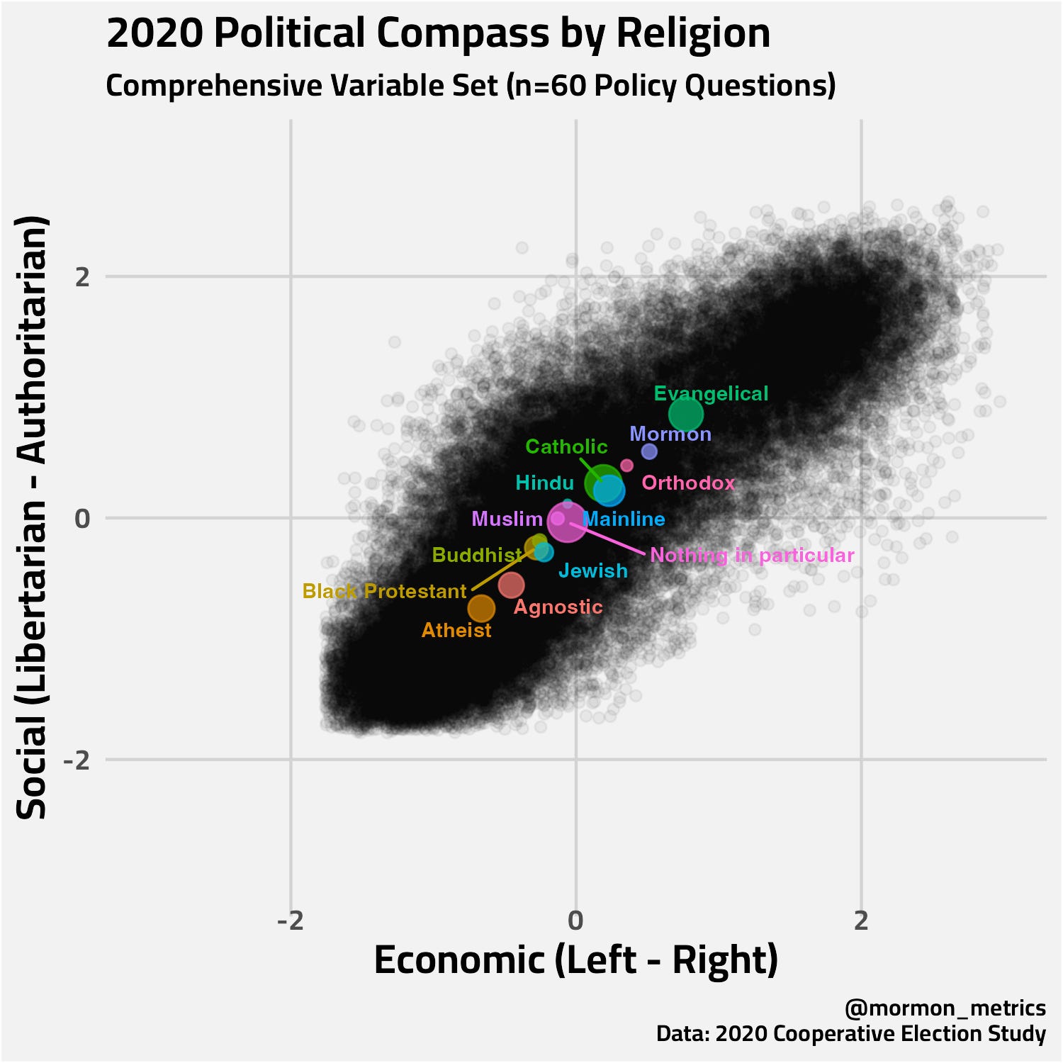
The Gap Widens: The relative distance between the Green and Purple dots has grown. It appears that Evangelicals have moved further into the “Populist Right” territory—higher on the authoritarian scale and further right economically.
Mormon Moderation: In contrast, the average Mormon appears to have drifted toward the center. By 2024, the Mormon dot is physically closer to the “Mainline Protestant” (Blue) and “Catholic” (Green-Yellow) clusters than it is to the Evangelical one. Contextualized by the political compasses before, we can again see a slight Mormon skew toward the libertarian quadrant.
What is the Story Here?
When viewing these charts in succession, the story isn’t necessarily that Mormons are all “Liberals” now (the average remains in the top-right quadrant). Rather, the data suggests that the Republican Party may have moved, and Mormons didn’t fully go with them.
As the GOP—driven by the Evangelical base—shifted toward a specific style of governance characterized by higher Social Authoritarianism, the Mormon electorate appears to have acted somewhat as an anchor, staying rooted in a more traditional, institutionalist conservatism.
In 2008/12, a Mormon and an Evangelical were politically indistinguishable in this model. Today, they appear to be distinct voting blocs with diverging priorities.
Other Observations in the Data
While my primary focus was the Mormon drift, having the full dataset reveals a few other interesting trends happening in the background:
The “True Center” is ‘Nothing in Particular’ In political science, we are always hunting for the median voter. It is interesting to note the position of the Pink Bubble (”Nothing in Particular”). In almost every chart (2008–2024), this group hovers incredibly close to the dead center (0,0) of the grid. While the parties race to the edges, this disjointed, secular-ish middle appears to be the most stable group in the field.
The Catholic-Mainline Convergence We often talk about the “Protestant Ethic” or the “Catholic Vote” as distinct cultural forces. However, these charts suggest that, politically speaking, they are functionally very similar. The Blue Bubble (Mainline) and Green Bubble (Catholic) move in lockstep almost every year.
The Movement of Atheists If Evangelicals are moving to the Top-Right corner, Atheists/Agnostics (Orange/Red) appear to be moving further to the Bottom-Left. The “Culture War” seems to be visualized here as the tension stretching between these two groups.
General Polarization In earlier years, the electorate looked like a round-ish blob occupying plenty of space in all quadrants. In the most recent years, the blog looks more like a line with less variation suggesting deeper political polarization.
Thanks for reading. See you next year!
Code for this post is available here (nearly 1500 lines of code for a heavier lift this week). I also have a google sheet tracking each question used in this analysis, so you can get a sense of how these axes are constructed across time (a total of 198 questions across years!)
Any chance you can do this same analysis with the 4 clusters from your LDS typology? I would suspect the movement of the LDS dot is not just resisting the populist tendency of Evangelicals, but also includes some polarization and leftward drift of some subgroups within the LDS community as well. Would be great to see, if there is enough data to support an analysis.
Interesting insights. Thank you. When you consider public perceptions of associated qualities of kindness, compassion, peace, etc., of Buddhist and Hindu; it adds another divergent perspective to the evangelical push toward authoritarianism that Mormons don’t want to be associated with. I know, for me, that has been the case. As I view these charts I can see my own progression moving more towards black Protestants. A lot of my movement has come as a result of the lack of reverence for mankind I see in the approach of the current administration. It would be interesting to gather qualitative data on the “why” haven’t Mormons moved with the evangelicals.